MAKO CUSTOM HOMES
Something swimming in the negative space
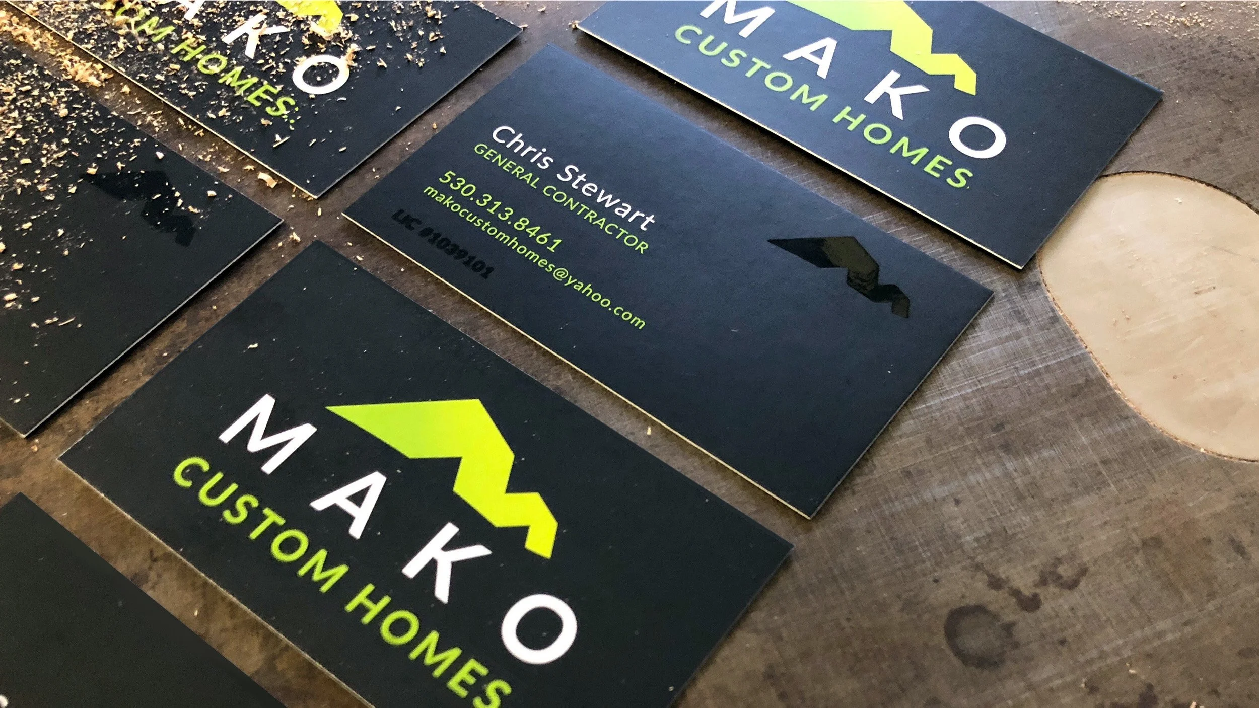
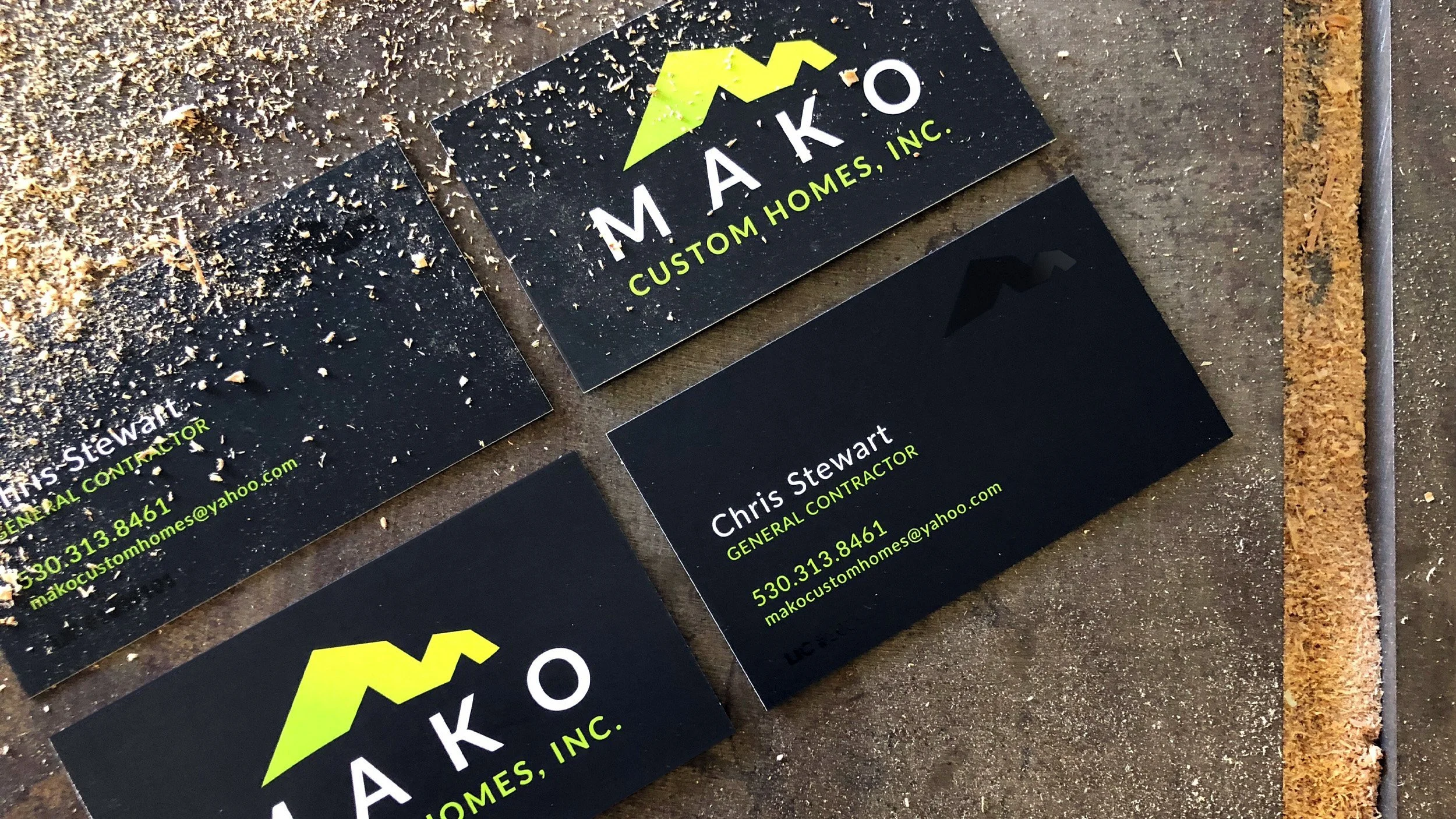
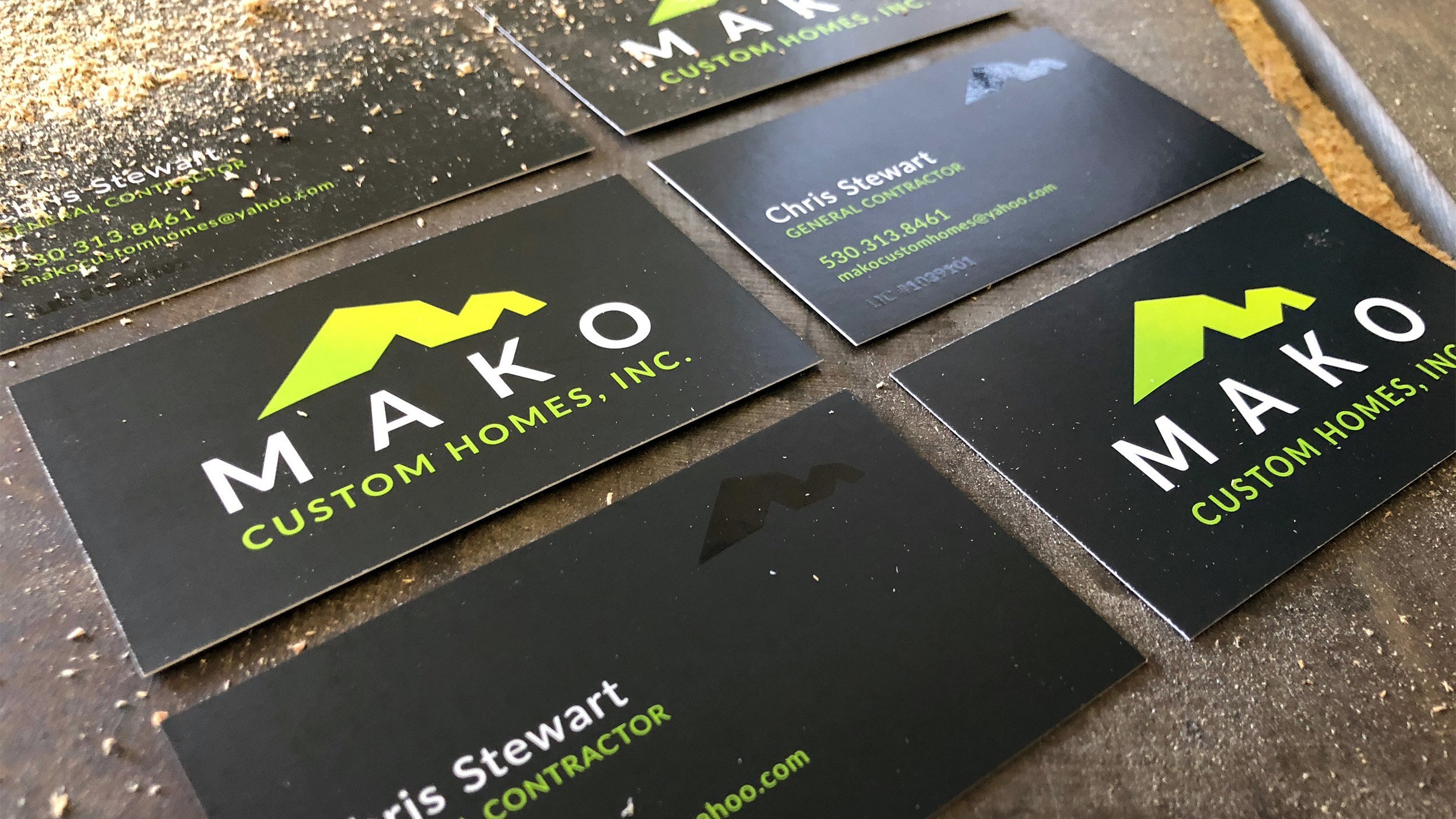
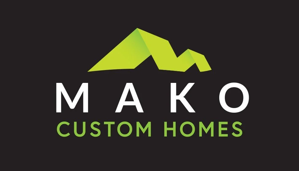
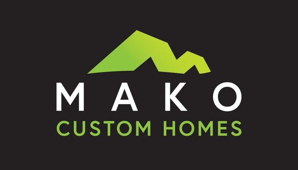
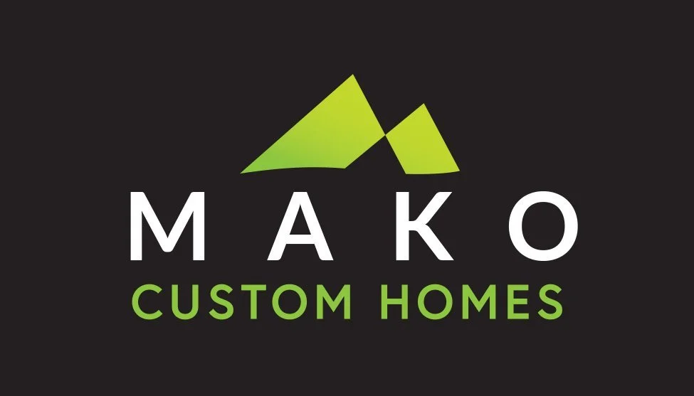
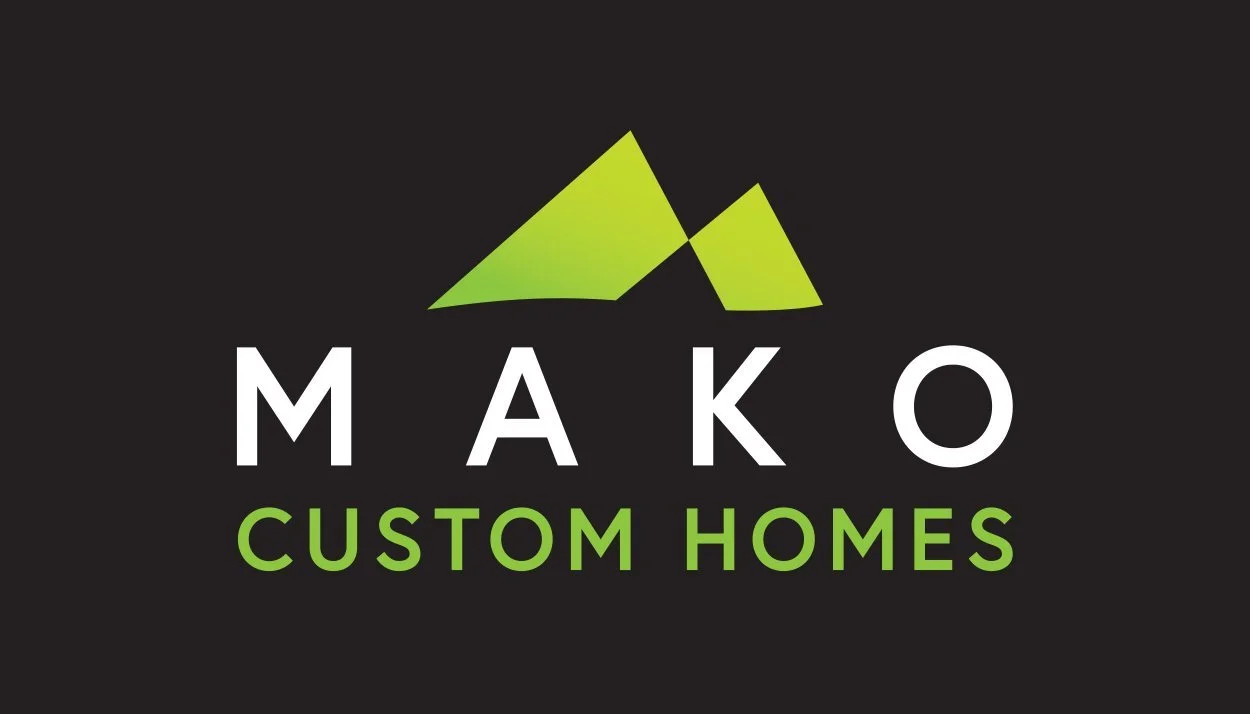
Chris didn't have a clear vision for his company logo, only that it needed to be black and safety green. When he shared a few generic, house-shaped contractor logos for reference, I saw an opportunity to create something more distinctive that reflected the strength of his company name, Mako.
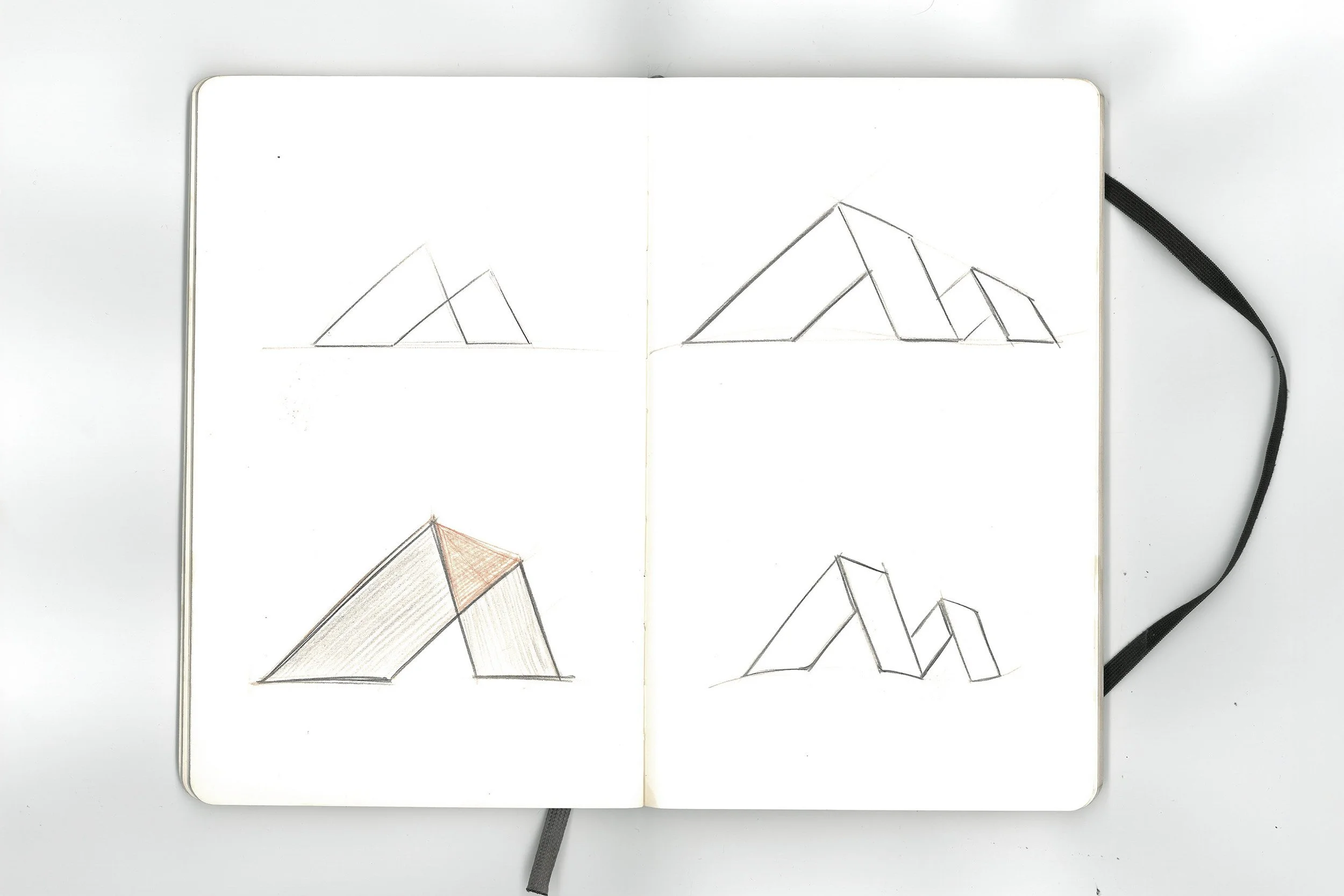
I began sketching and quickly noticed the natural connection between the triangular shape of an A-frame house, the letter "M," and a mako shark's fin. I aimed for the shark reference to feel subtle and intentional, hidden in the negative space for those who take a closer look.