DRAKE SOCIAL HOUSE / KENT DRAKE PHOTOGRAPHY
A clean look to unify two brand identities
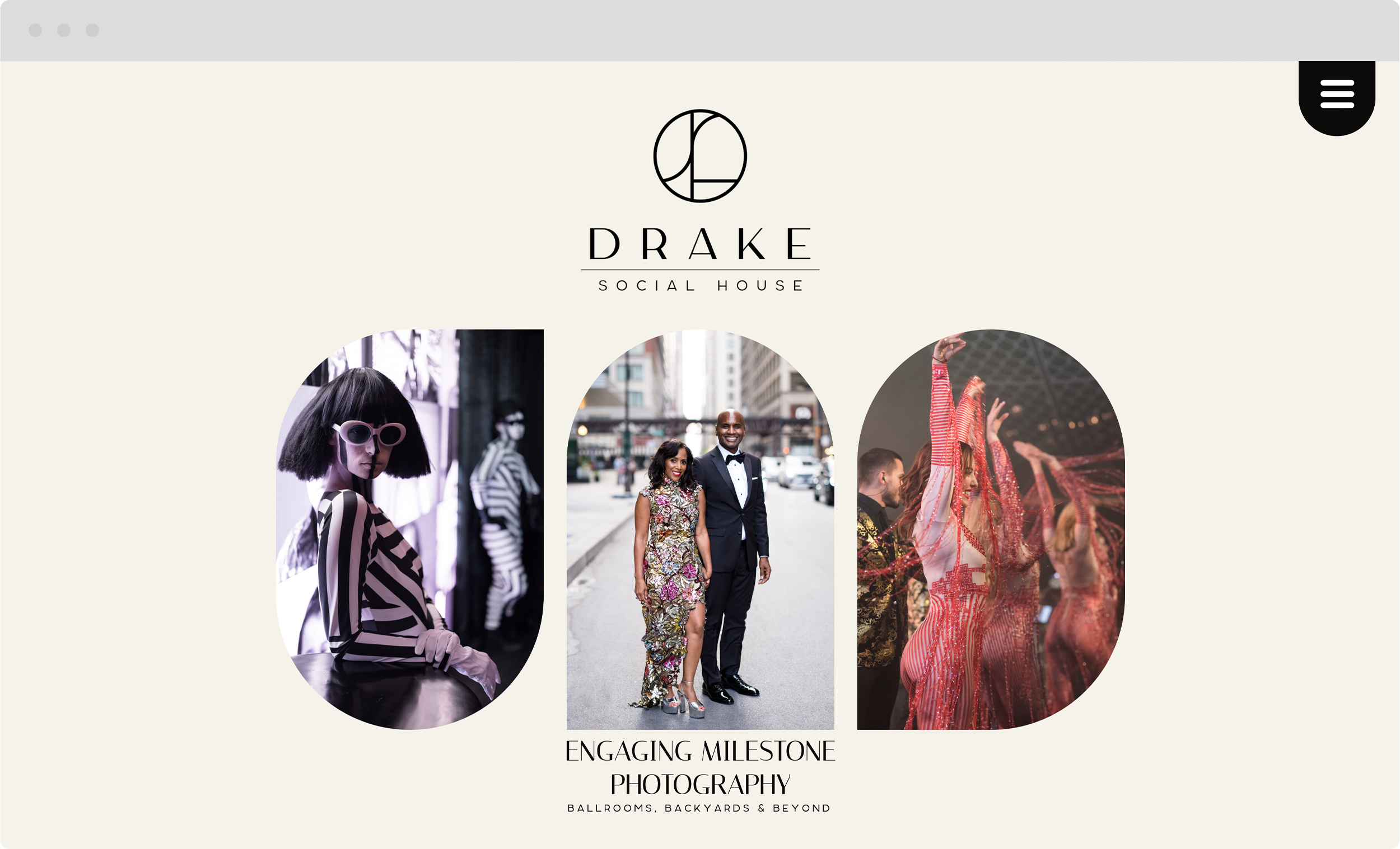
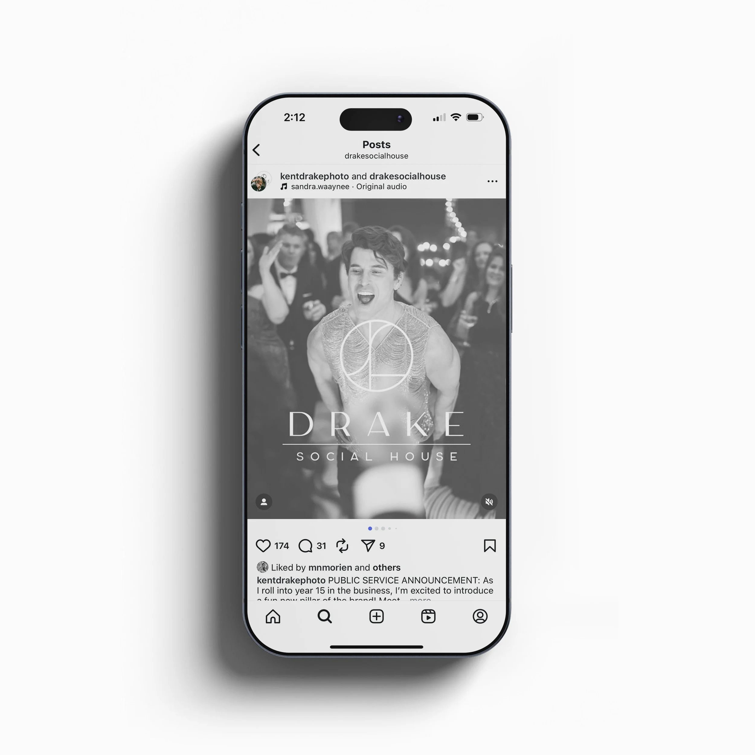
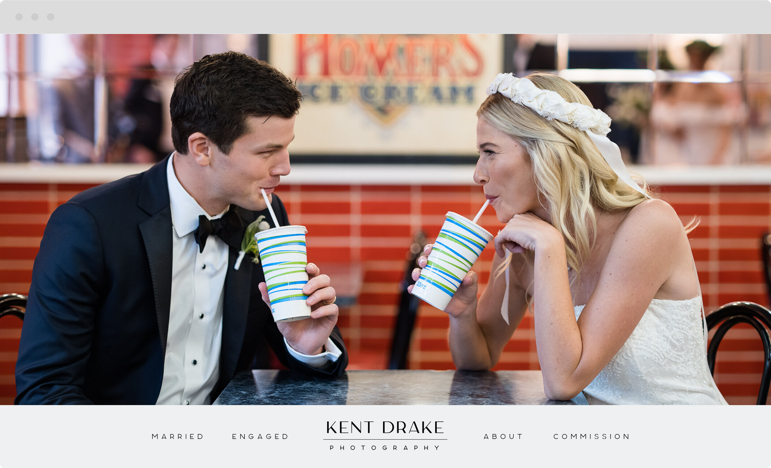
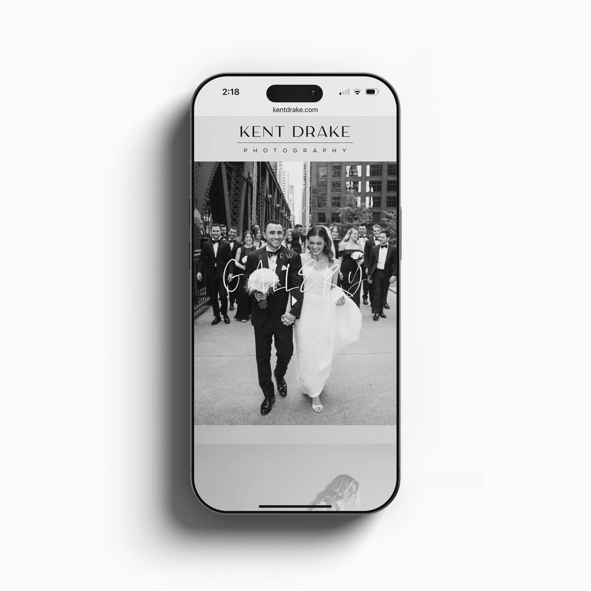
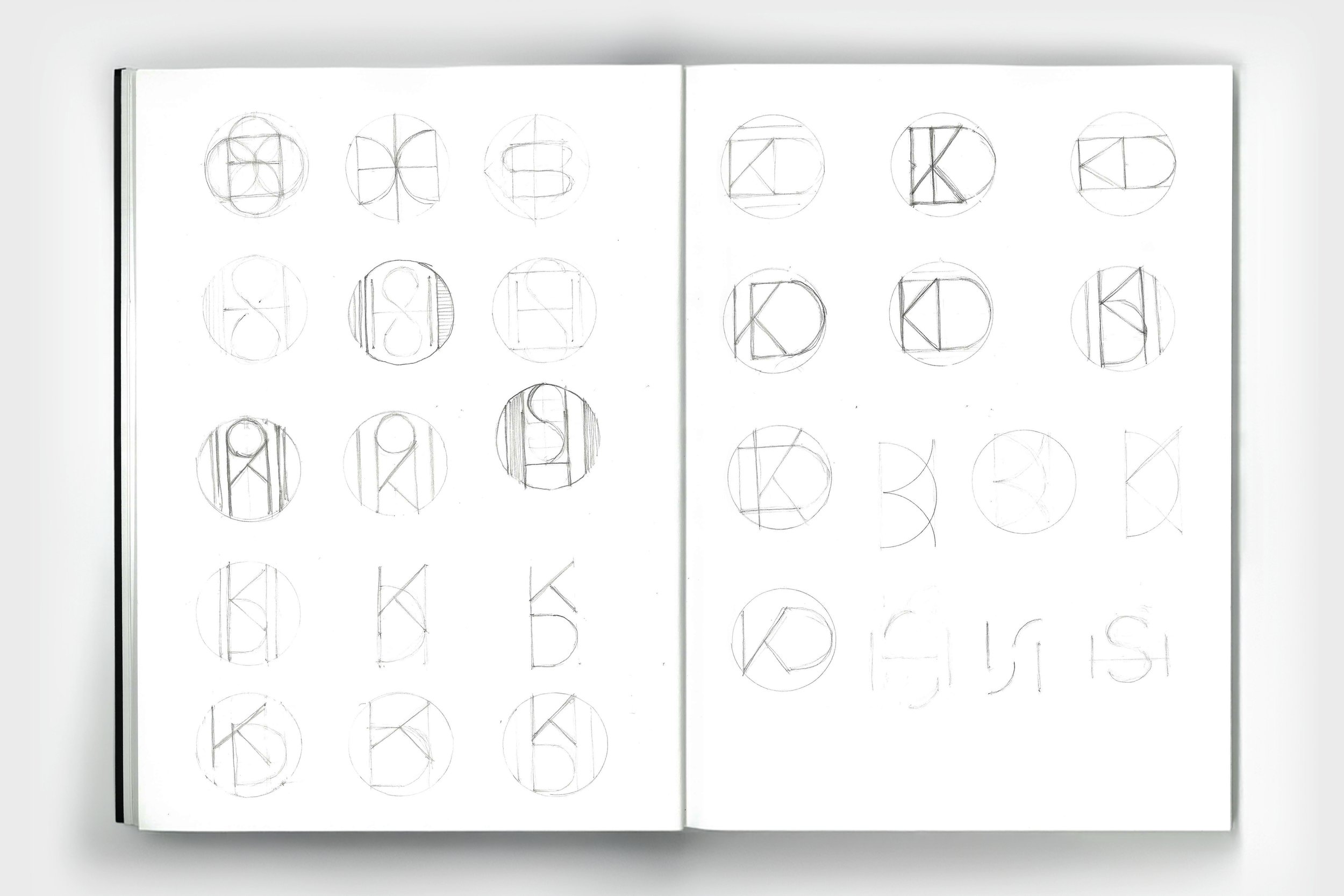
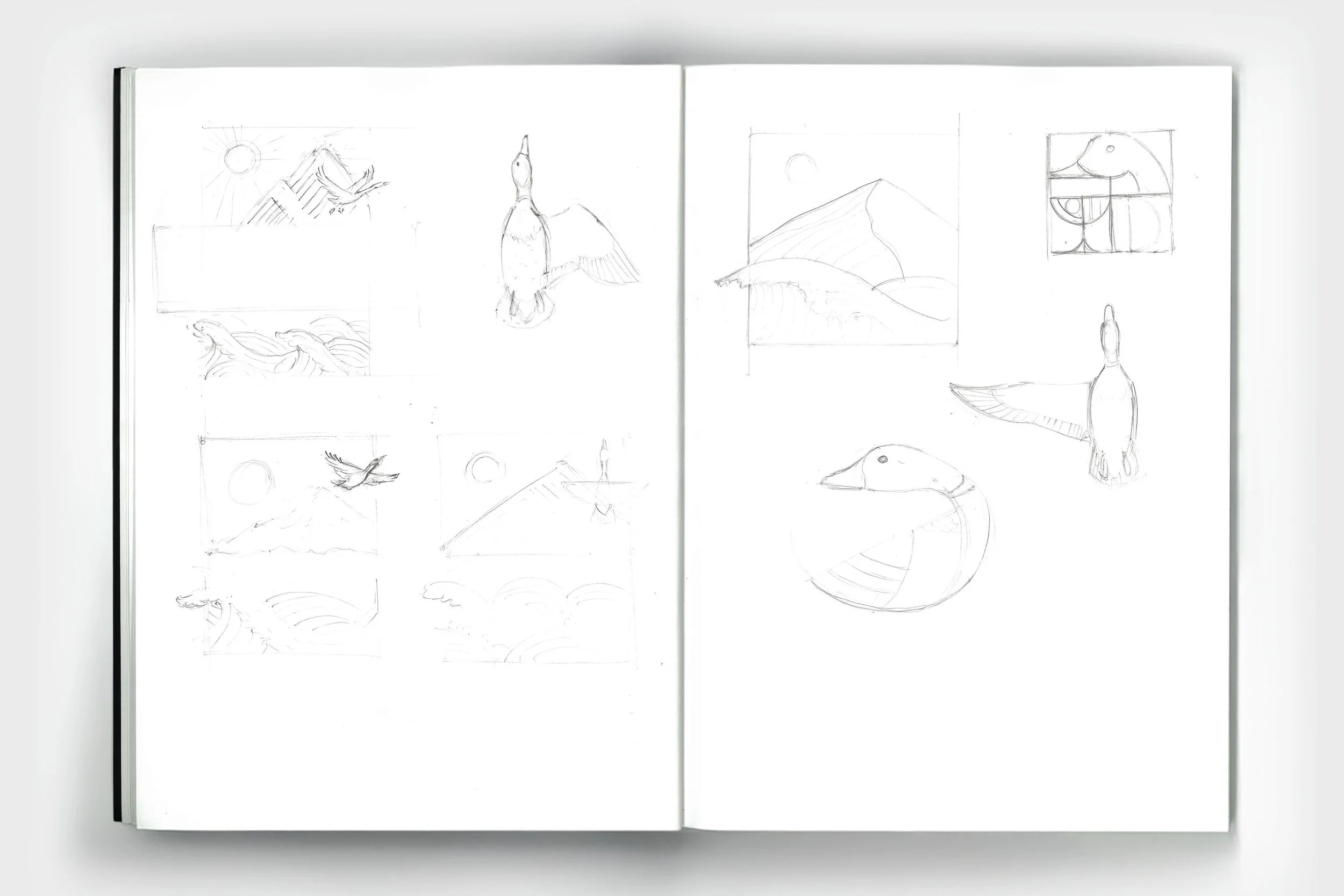
Kent—an old friend and admirer of my minimalist design style—approached me to rebrand his photography business and create a unified identity for a new spin-off venture. I developed a flexible system that allows him to use a monogram, logotype, or full mark depending on the context. The final identity is clean and timeless, anchored by a custom typeface inspired by Kent’s Art Deco sensibilities. The result is a cohesive brand that aligns with his aesthetic and elevates both sides of his business.